How to Work Visually with Data — Tutorial in R

Learn how to visually decode a data set before applying an ML algorithm on it
Data is numbers. Humans are not wired to work with a lot of numbers at once. Humans are visual creatures. So it always makes sense to get a visual interpretation of your data — much before you jump into applying machine learning on it.
1. First step — Preparing your data
Every machine learning project begins with preparing your dataset. This article describes the whole life cycle of an ML project. We will instead pick a prepared dataset.
We will be using the glass dataset from the r package mlbench.
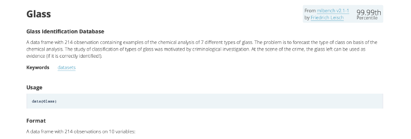
It has 214 observations containing examples of the chemical analysis of 7 different types of glass.
2. Install and load the libraries
We will be using 2 R libraries for this tutorial.
- ML Bench
- Corrplot
#clear all objects
rm(list = ls(all.names = TRUE))
#free up memrory and report the memory usage
gc()
#Load the libraries
library(mlbench)
library(corrplot)
3. Load the data
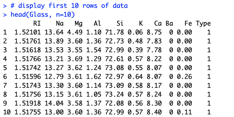
Then we actually load the dataset and display its first few datapoints.
#Load the dataset
data("Glass")
# display first 10 rows of data
head(Glass, n=10)
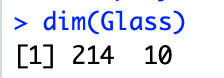
# display the dimensions of the dataset
dim(Glass)We quickly get a hang of which columns are there and their respective value ranges. If your dataset is huge, which it often is, you can take a small sample and review that.
With a quick glance we can see that the columns correspond to chemical elements — (Sodium : Na, Magnesium : Mg, …).
We also see that each row has 9 different features. All of them contribute to the type of glass. The final column tells you about the actual type of the glass.
Such a dataset could be used for building a logistic regression model which predicts glass type based on the 9 features.
Also noting down the dimensions of data gives us an idea about how big is the dataset
4. Understanding each feature
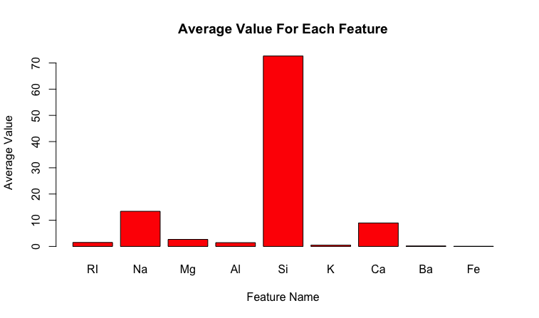
Then we try to get a hang of the statistical and other properties of data
# list types for each attribute
sapply(Glass, class)
# standard deviations and mean for each class
y<-sapply(Glass[,1:9], mean)
sapply(Glass[,1:9], sd)
xn<-colnames(Glass[,1:9])
x<-c(1:9)
y<-sapply(Glass[,1:9], mean)
barplot(y, main = "Average Value For Each Feature",
     xlab = "Feature Name",
     ylab = "Average Value")
We can also look at the datatypes to assess data compatibility.

Note that the last column is a categorical data type called factor and the rest are numerical floats. This information is very important because the types dictate the further analysis, types of visualisations and even the learning algorithms that you should use.
We can also plot the standard deviation of each feature to guide our normalization process later on.

The standard deviation along with the mean are useful tools
For example, for Gaussian distribution it can act as a quick outlier removal tool, where any values that are more than thrice the standard deviation are considered an outlier.
5. Understanding each class
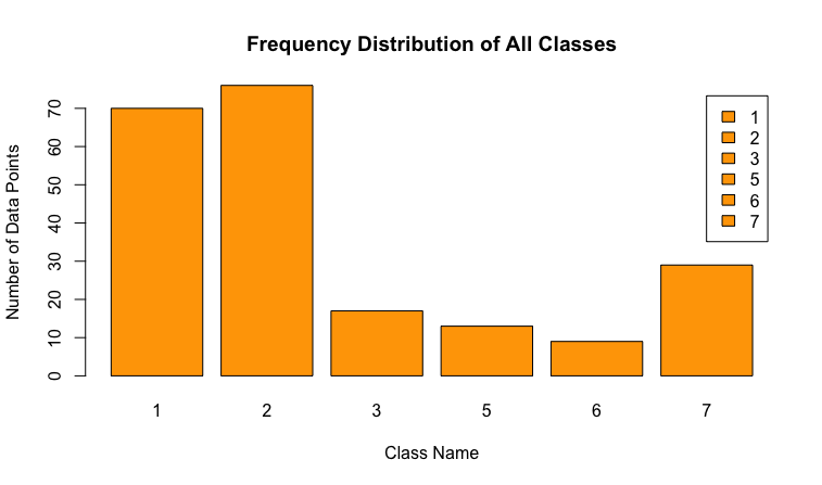
Apart from looking at the data according to its features, we can also analyze each class. One quick thing to test could be the class distribution
In any classification problem, you must know the number of instances that belong to each class value. This acts as a quick test of an imbalance in the dataset. In the case of a multi-class classification problem, it may expose classes with a small or zero instances that may be candidates for removing from the dataset. This then can be augmented with rebalancing techniques.
# distribution of class variable
y <- Glass$Type
cb <- cbind(freq=table(y), percentage=prop.table(table(y))*100)
barplot(table(y), main = "Frequency Distribution of All Classes",
        xlab = "Class Name",
        ylab = "Number of Data Points", legend = TRUE)
6. Relation between features
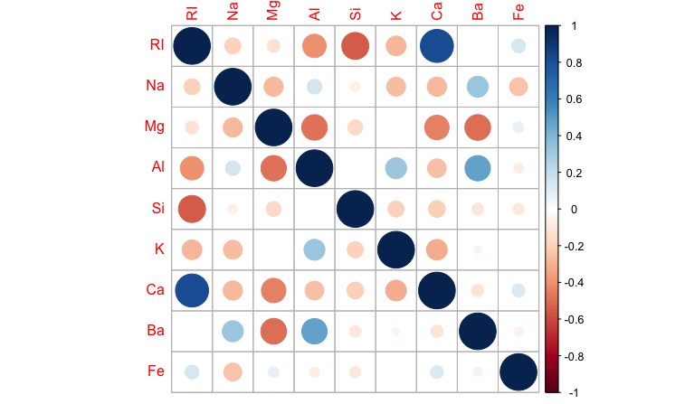
One of the most important relations to look at is correlation between features. In ML we never want features that are highly correlated. This article shows the technique to detect such features when implementing KNN (K-Nearest Neighbour) algorithm, using Python. As a quick test in R we can do the following
# calculate a correlation matrix for numeric variables
correlations <- cor(Glass[,1:9])
# display the correlation matrix
print(correlations)
corrplot(correlations, method = "circle")
Positive correlations are displayed in blue and negative correlations in red color. Color intensity and the size of the circle are proportional to the correlation coefficients.
We can easily see that Ca is highly correlated with RI and can remove one of those from our analysis.
Visually decoding your dataset gives you the fastest way to understanding your dataset. This becomes a very important precursor to actually applying the machine learning algorithm.
Member discussion