Play With Your ML Dataset — Cheatsheet in R

Quick R commands to look at your data from different perspectives
Understanding data usually is half the battle won. For any machine learning project it helps immensely to analyze your data from different points of view.
Summarising a dataset means understanding how your data looks when subjected to simple statistical anaylsis.
To illustrate the various techniques let us consider the glass dataset from the r package mlbench.
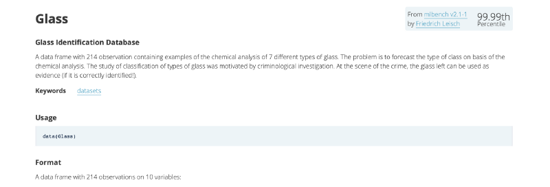
It has 214 observations containing examples of the chemical analysis of 7 different types of glass.
Loading the libraries
rm(list = ls(all.names = TRUE)) #will clear all objects includes hidden objects.
gc() #free up memrory and report the memory usage.
#Load the library
library(mlbench)
library(corrplot)
Loading the data
#Load the dataset
data("Glass")
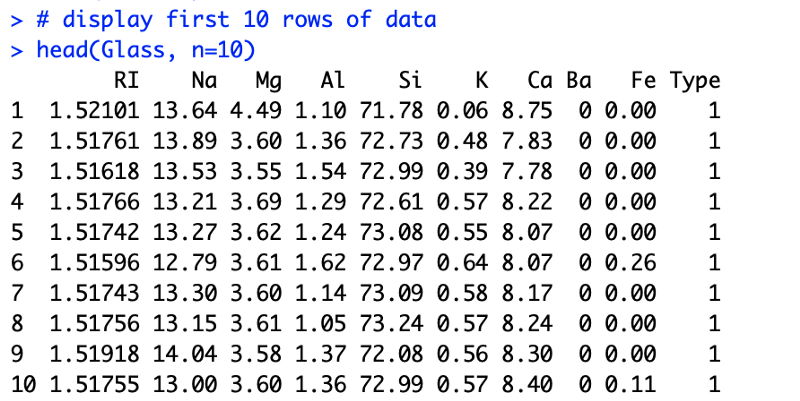
# display first 10 rows of data
head(Glass, n=10)
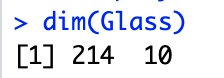
# display the dimensions of the dataset
dim(Glass)For a quick look we try to display the first 10 rows of the data. We quickly get a hang of which columns are there and their respective value ranges. If your dataset is huge, which it often is, you can take a small sample and review that.
We immediately see that each row has 9 different features. All of them contribute to the type of glass. The final column tells you about the actual type of the glass.
Such a dataset could be used for building a logistic regression model which predicts glass type based on the 9 features.
Also noting down the dimensions of data gives us an idea about how big is the dataset
Understanding each feature
# list types for each attribute
sapply(Glass, class)
# standard deviations and mean for each class
y<-sapply(Glass[,1:9], mean)
sapply(Glass[,1:9], sd)
xn<-colnames(Glass[,1:9])
x<-c(1:9)
y<-sapply(Glass[,1:9], mean)
barplot(y, main = "Average Value For Each Feature",
     xlab = "Feature Name",
     ylab = "Average Value")
First a quick check for data types can be done to see if all columns have similar types

We can see that the last column is a categorical data type called factor and the rest are numerical floats. You need to know the types of the attributes in your data. This is very important because the types dictate the further analysis, types of visualisations and even the learning algorithms that you should use.
Then let us look at each feature’s mean value and standard deviation across all classes/types.
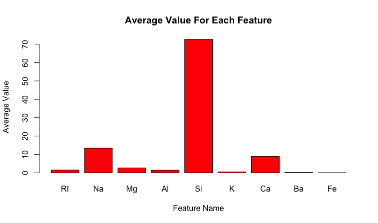
This gives us a quick idea about the scale of each feature and helps with normalisation later on.

The standard deviation along with the mean are useful to know. For example, for Gaussian distribution it can act as a quick outlier removal tool, where any values that are more than thrice the standard deviation are considered an outlier.
Understanding each class
Instead of looking at the data according to its features we can also analyze each class. One quick thing to test could be the class distribution
In any classification problem, you must know the number of instances that belong to each class value. This acts as a quick test of an imbalance in the dataset. In the case of a multi-class classification problem, it may expose classes with a small or zero instances that may be candidates for removing from the dataset. This then can be augmented with rebalancing techniques.
# distribution of class variable
y <- Glass$Type
cb <- cbind(freq=table(y), percentage=prop.table(table(y))*100)
barplot(table(y), main = "Frequency Distribution of All Classes",
        xlab = "Class Name",
        ylab = "Number of Data Points", legend = TRUE)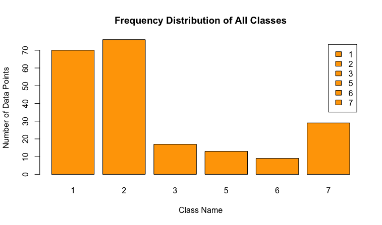
Correlation between features
In ML we never want features that are highly correlated. This article shows the technique to detect such features when implement KNN (K-Nearest Neighbour) algorithm, using Python. As a quick test in R we can do the following
# calculate a correlation matrix for numeric variables
correlations <- cor(Glass[,1:9])
# display the correlation matrix
print(correlations)
corrplot(correlations, method = "circle")
The correlation matrix looks like this
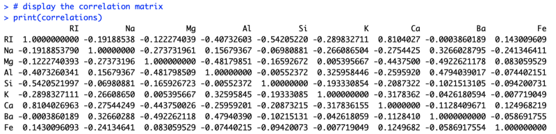
But this is too difficult to analyze by looking at it. So we resort to the correlation plot.
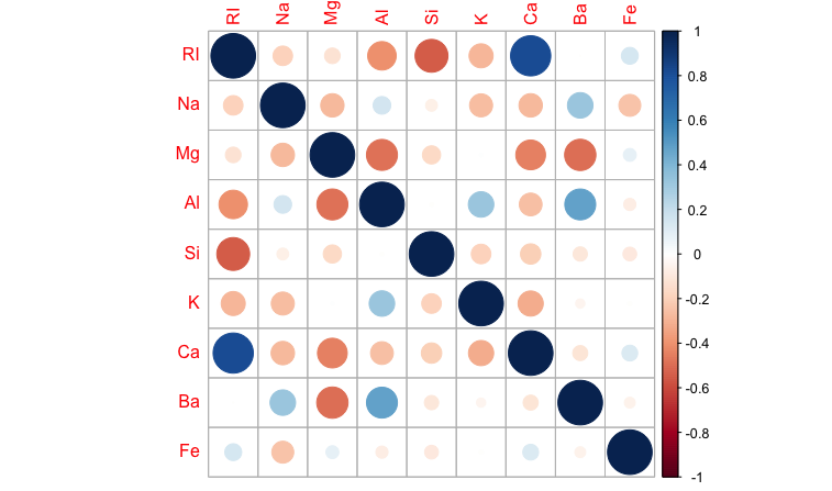
Positive correlations are displayed in blue and negative correlations in red color. Color intensity and the size of the circle are proportional to the correlation coefficients.
We can easily see that Ca is highly correlated with RI and can remove one of those from our analysis.
There are a plethora of other analysis that you can subject your data to. R and Python provide very easy to use libraries for this purpose.
A deeper understanding of your data is destined to give you great results. Taking the time to study the data you have will help you in ways that are less intuitive. You build a knack for the data and for the entities that individual records or observations represent. Though these can bias you towards specific results, more often than not it clarifies your thought process.
X8 aims to organize and build a community for AI that not only is open source but also looks at the ethical and political aspects of it. More such simplified AI concepts will follow. If you liked this or have some feedback or follow-up questions please comment below.
Thanks for Reading!
Member discussion