Beginner’s Guide to Piping Data in R

Combine a variety of in-built functions with pipe operator to do powerful data analysis
The pipe operator %>% is used to pass the output of a function to another function, thereby enabling functions to be chained together. The end result is a block of very readable code with separate functions chained together.
Let’s see an example to understand. Consider the following 3 functions
- Square of a number — square
- Double of a number — double
- Inverse of a number — inverse
- Rounding off a number to 1 decimal place — round
Let’s say we want to apply these three functions to an array of numbers. One way to do that is to chain these functions together
#An array of numbers [0.1, 0.2, 0.3, ...., 1]
x = seq(0.1,1,by=0.1)

#Chaining Them Together
round(square(double(inverse(x)), digits=1)
For longer chains it is harder to read and difficult to keep track of parenthesis. Consider the alternative using pipes
#An array of numbers [0.1, 0.2, 0.3, ...., 1]
x <- seq(0.1,1,by=0.1)

#Pipeline of functions
x %>% square %>% double %>% inverse %>% round(digits=1)
The output is the same for both
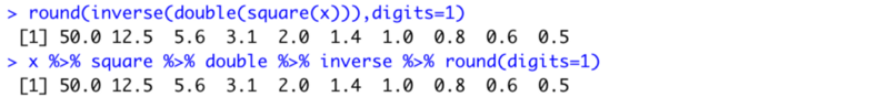
Note that the piping starts from left to right. The array x is first squared, then doubled, then inverted and finally rounded off.
Usage
To use the pipe function just include the library tidyverse. Tidyverse is a collection of the most used packages in R. Once you successfully install and include it you can use the pipe operator in your code.
Install tidyverse
install.packages("tidyverse")To include it in your code just write
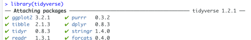
library(tidyverse)Once executed, this statement attaches various packages to your environment. Note, that it includes various string manipulation packages as well as the plotting library ggplot2.
Now let’s try to use pipe function in a real world situation. In the following example we will extract COVID-19 data from
Covid Dataset Analysis
The aim of the analysis will be to see the countries where the number of cases reported today were less than 10. With as much ease we can also observe the countries where the cases were greater than a threshold.
We will use COVID-19 data set compiled by the Johns Hopkins University Center for Systems Science and Engineering (JHU CCSE) from various sources including the World Health Organization (WHO), BNO News, etc. JSU CCSE maintains the data on the 2019 Novel Coronavirus COVID-19 (2019-nCoV) Data Repository on github.
Novel Coronavirus (COVID-19) Cases Data
Novel Corona Virus (COVID-19) epidemiological data since 22 January 2020. The data is compiled by the Johns Hopkins…data.humdata.org
Fetching the data
We fetch the data using the read_csv function. For the purposes of our analysis we will analyse only the confirmed cases.
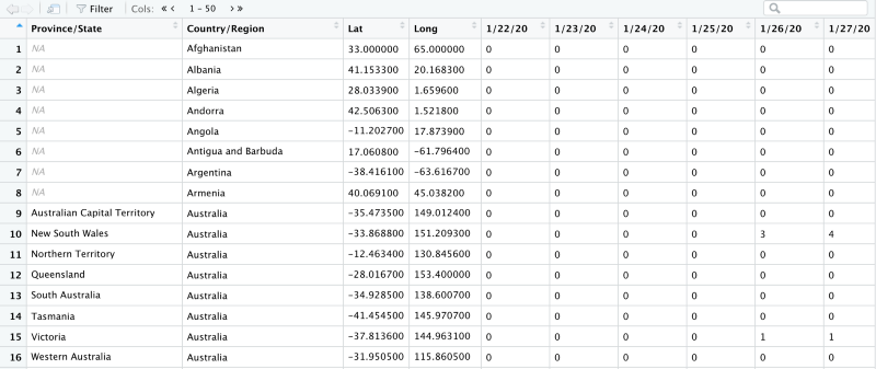
confirmed_raw <- read_csv(link_to_data)Running this command gives us a dataframe of 264 rows and 86 columns. Note that the variable link_to_data is a very long hyperlink and can be copied from the gist attached at the end of the article.

Data Head
head(confirmed_raw)The head of the data summarises the dataset for us. It shows us the following information
- The first 6 rows of data
- Column Names
- Column Count
- Column Types
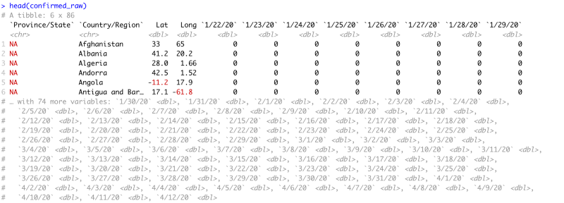
We can see that the first four columns describe the country’s details for which the data is collected. Every column after that is for a single day with the latest data at the end. Notice that after 29th January the head command clips the data set because it is too large to view and displays all the column names in a commented-out form.
Piping the data
Now let’s start piping the data.
We will pipe the data through following methods
- Selecting a subset of dataframe
- Renaming of columns
- Filtering out those rows which have greater than 10 cases
- Grouping the rows by Country and displaying the sum of all cases across provinces. (A single country may have multiple rows, with each row for a different state/province)
The dataset looks like this
Selecting a subset
The select function works like this
#To Keep Only Columns M through N
select(c(M,N))

#To Remove Columns M through N
select(-c(M,N))

#e.g. Keep columns 2 to 10
select(c(2,10))
In the raw dataframe we see that the data starts on 22nd January. We do not want all the data. We just want the first 4 columns and the confirmed cases for today and yesterday. So we select columns 1 to 4 and columns 85 to 86. We assign this data to conf_subset variable.
conf_subset <- confirmed_raw %>%
  select(c(1:4),c(85,86))
Notice how we piped the bigger dataframe into the select function. The conf_subset looks like this.
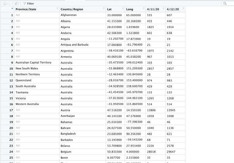
Notice that now we are left with only 2 columns of data. 4/12/20 and 4/11/20.
Renaming the data
We do not, however, want the names of our columns to be dates. So we will rename them to today and yesterday. Also, we do not want names like Province/State or Country/Region. So we will rename them to Province and Country respectively.
conf_subset <- confirmed_raw %>%
  select(c(1:4),c(85,86)) %>%
  rename(Country   = "Country/Region",
         Province  = "Province/State",
         today     = colnames(confirmed_raw)[86],
         yesterday = colnames(confirmed_raw)[85]
  )
Notice how we piped the data to rename method. This is how the dataframe looks now.
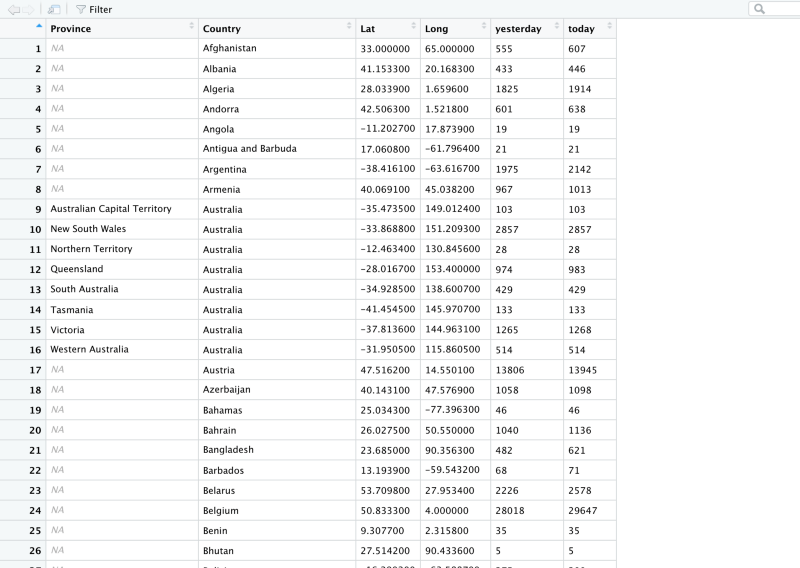
Now we have the column names we want. The problem is that we still have 264 rows of data. Let’s see how that looks on a plot.
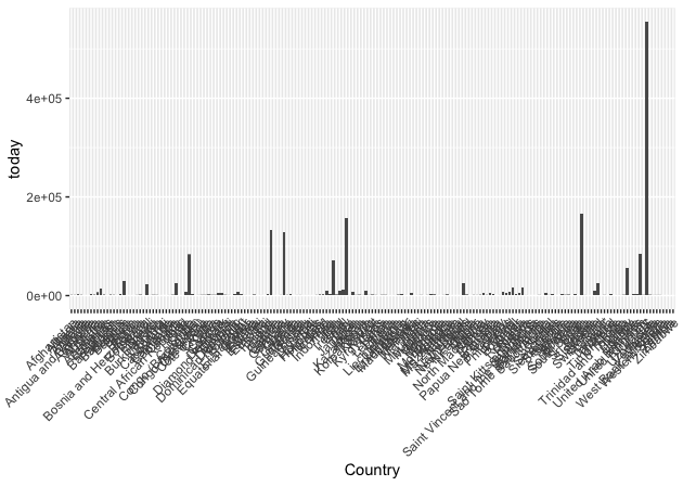
That’s too many countries. The highest bars correspond to countries like USA and Italy.
Filtering by count
Now let’s remove all those countries and provinces that have a count of greater than 10 today.
conf_subset <- confirmed_raw %>%
  select(c(1:4),c(85,86)) %>%
  rename(Country   = "Country/Region",
         Province  = "Province/State",
         today     = colnames(confirmed_raw)[86],
         yesterday = colnames(confirmed_raw)[85]
  ) %>%
  filter( today < 10) #%>%
We are left with just 28 rows
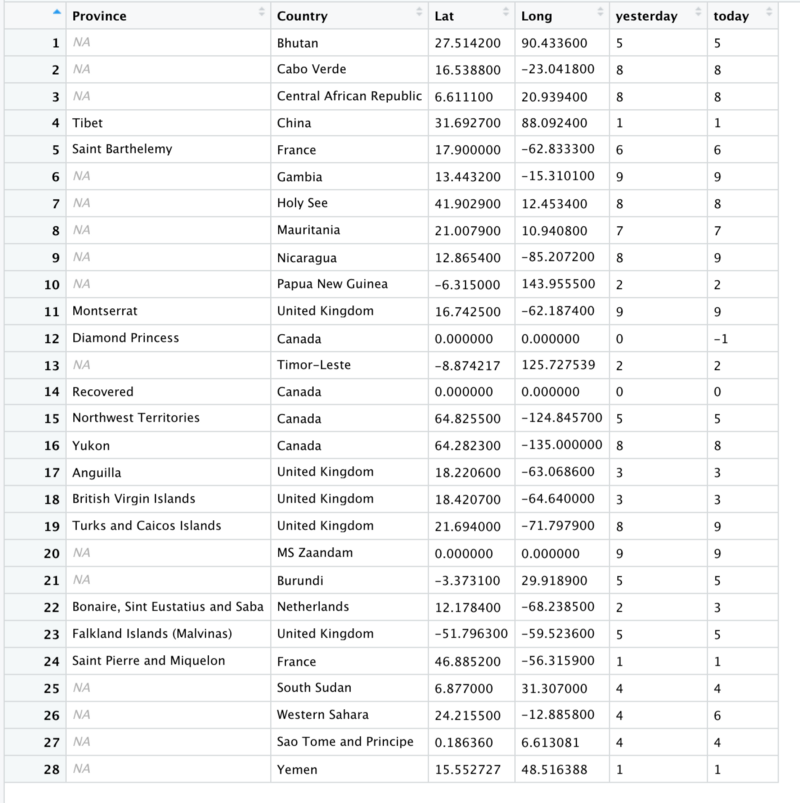
Notice United Kingdom and Canada. Both of them occupy multiple rows and each of them has the count for some province of theirs. Let’s see how that looks on a plot.
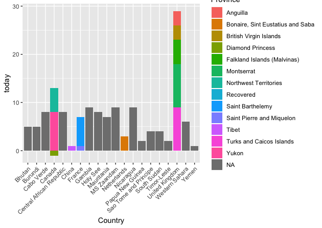
Look at the fourth bar that corresponds to Canada. There is 1 province of Canada that reports a negative number so the bar goes below 0. A negative number might mean a falsely reported confirmed case. Similarly, pay attention to the third-last bar corresponding to the United Kingdom.
Grouping by countries
We don’t want to see the province data separately. We want to see all of that added together.
conf_subset <- confirmed_raw %>%
  select(c(1:4),c(85,86)) %>%
  rename(Country   = "Country/Region",
         Province  = "Province/State",
         today     = colnames(confirmed_raw)[86],
         yesterday = colnames(confirmed_raw)[85]
  ) %>%
  filter( today < 10) #%>%

  group_by(Country) %>%
    summarise(
      Yesterday = sum(yesterday),
      Today = sum(today)
    )
Note that the group_by method goes along with the summarise method because once grouped we can then perform functions on each group. e.g. here we perform sum() on each group.
So that gives us the following dataframe
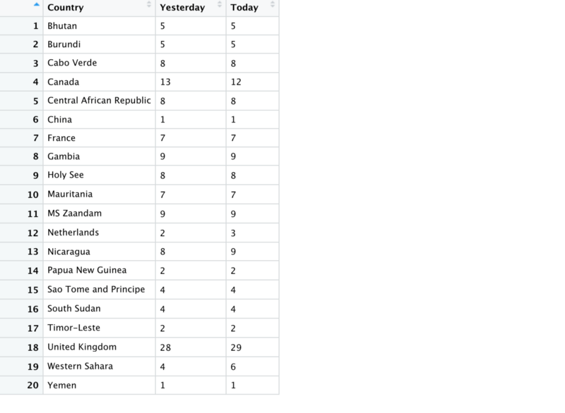
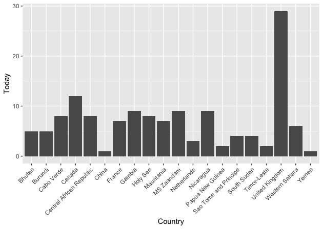
Note that Canada’s data is summed and drops by 1 from yesterday to today. When plotted the data looks like this.
The whole pipeline of methods looks like this
confirmed_raw %>% select %>% rename %>% filter %>% group_by %>% summariseYou can add many more methods to this chain. We can see that after 10 or more methods this piping becomes to unwieldy.
When to avoid pipes
Hadley Wickham the inventor of pipes states in his blog the times when piping may not be useful.
When not to use the pipe
The pipe is a powerful tool, but it’s not the only tool at your disposal, and it doesn’t solve every problem! Pipes are most useful for rewriting a fairly short linear sequence of operations.
- Longer than 10 steps — In that case, create intermediate objects with meaningful names. That will make debugging easier, because you can more easily check the intermediate results
- Multiple inputs or outputs — If there isn’t one primary object being transformed, but two or more objects being combined together, don’t use the pipe.
- Complex Dependency Structure — Pipes are fundamentally linear and expressing complex relationships with them will typically yield confusing code.
Having said that do try to use pipes in your next data analysis effort and reap the benefits of this tool. The gist for the complete code along with plotting steps is below.
Rahul has created a very beautiful open source dashboard completely in R that shows informative visualizations on how the COVID disease is progressing.
Dashboard - India against COVID19
Member discussion