KNN Classification Algorithm in Python

This is a Python code walkthrough of how to implement k-nearest neighbours algorithm
K-nearest neighbours is a classification algorithm. This article explains the the concept behind it. Let us look at how to make it happen in code.
We will be using a python library called scikit-learn to implement KNN.

Scikit-Learn is a very powerful machine learning library. It was initially developed by David Cournapeau as a Google summer of code project in 2007.
This library contains some datasets. Today we will be using the Breast Cancer Wisconsin Dataset and looking at how to implement KNN Algorithm
Loading the dataset
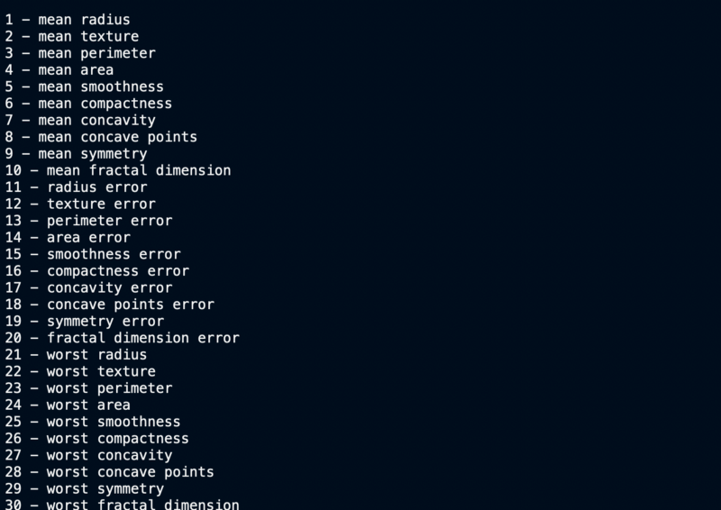
This is a dataset that contains 569 datapoints. Each datapoint has values on 30 features. Together these features determine whether a person’s cells are malignant cells or benign.
from sklearn.datasets import load_breast_cancer
data = load_breast_cancer()
Understanding the dataset
# Print the information contained within the dataset
print(data.keys(),"\n")
#Print the feature names
count=0
for f in data.feature_names:
 count+=1
 print(count,"-",f)
#Print the classes
print(data.target_names,"\n")
#Printing the Initial Few Rows
print(data.data[0:3], "\n")
#Print the class values of first 30 datapoints
print(data.target[0:30], "\n")
#Print the dimensions of data
print(data.data.shape, "\n")
Information in the data (‘data’, ‘target’, ‘target_names’, ‘DESCR’, ‘feature_names’, ‘filename’)
- ‘data’ — actual data
- ‘target’ — class values
- ‘target_names’ — class names: malignant/benign
- ‘feature_names’ — name of the various attributes which decide malignancy
Feature names
Target Values, Names and Data Dimensions
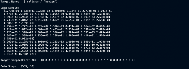
We can clearly see that the dataset has 30 columns and 569 rows. Now let us build a model for it.
Plotting the data
Splitting Data
To understand model performance, we need to first divide the dataset into a training set and a test set.
Let’s split dataset by using function train_test_split(). You need to pass 3 parameters features, target, and test_set size. You can also (optionally) use random_state to select records randomly. In our case we do a 90–10 split for training v/s the test set.
# Import train_test_split function
from sklearn.model_selection import train_test_split

# Split dataset into training set and test set
X_train, X_test, y_train, y_test = train_test_split(data.data, data.target, test_size=0.1) # 90% training and 10% test
Filtering out the useless features
We have 30 attributes that define the data. Not all of them necessarily are useful towards our classification problem. Correlation easily weeds out the unimportant features.
If 2 features are highly correlated, then they convey the same information. Hence one of them can be removed.
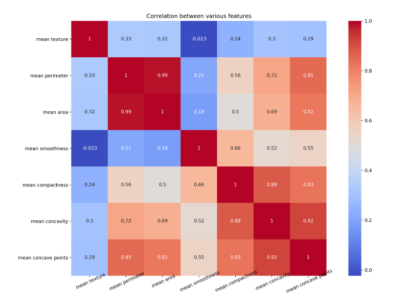
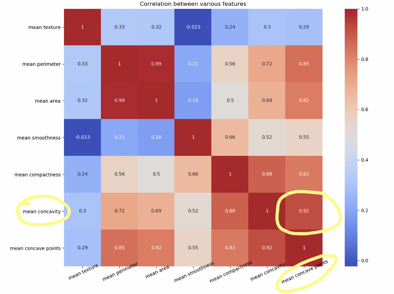
Let us draw a heat map to understand the correlation. The right diagonal is always 1 because the correlation of a feature with itself is 1.
The code for the above map is as follows
#Import the necessary libraries
import seaborn as sns
import pandas as pd
import matplotlib.pyplot as plt
import numpy as np

#Arrange the data as a dataframe
data1 = pd.DataFrame(data.data)
data1.columns = data.feature_names

# Plotting only 7 features out of 30
NUM_POINTS = 7
features_mean= list(data1.columns[1:NUM_POINTS+1])
feature_names = data.feature_names[1:NUM_POINTS+1]
print(feature_names)
f,ax = plt.subplots(1,1) #plt.figure(figsize=(10,10))
sns.heatmap(data1[features_mean].corr(), annot=True, square=True, cmap='coolwarm')
# Set number of ticks for x-axis
ax.set_xticks([float(n)+0.5 for n in range(NUM_POINTS)])
# Set ticks labels for x-axis
ax.set_xticklabels(feature_names, rotation=25, rotation_mode="anchor",fontsize=10)

# Set number of ticks for y-axis
ax.set_yticks([float(n)+0.5 for n in range(NUM_POINTS)])
# Set ticks labels for y-axis
ax.set_yticklabels(feature_names, rotation='horizontal', fontsize=10)

plt.title("Correlation between various features")
plt.show()
plt.close()
Notice how mean concave points feature has 0.92 correlation with mean concavity feature.
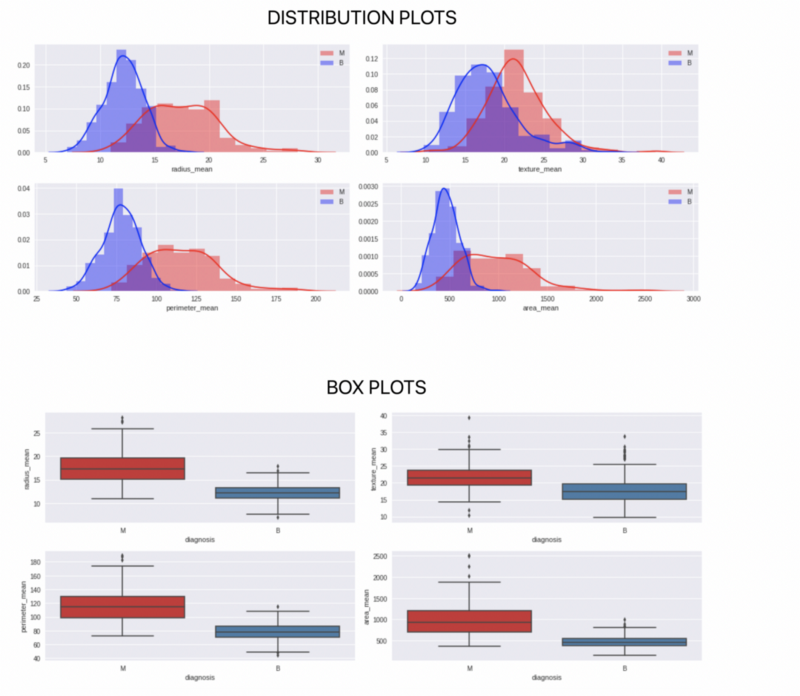
Scatter Matrix
Another way to look at highly correlated features is by plotting scatter matrix

The more spread out the points the less correlated the feature. Look at the two almost straight lines in the third row, second column squares.
The code for scatter matrix is as follows
#Color Labels - 0 is benign and 1 is malignant
color_dic = {0:'red', 1:'blue'}
target_list = list(data['target'])
colors = list(map(lambda x: color_dic.get(x), target_list))

#Plotting the scatter matrix
sm = pd.plotting.scatter_matrix(data1[features_mean], c= colors, alpha=0.4, figsize=((10,10)))
plt.suptitle("How well a feature separates the Malignant Points from the Benign Ones")
plt.show()
There are other kinds of plotting that one can do to further analyse every feature and the 2 classes.
Building the model and testing accuracy
Finally we come to the stage where we build our model and test the accuracy of our model. An important thing to define here is the value of K. Let us use K = 1, 5 and 10 as the values for K and see the results.
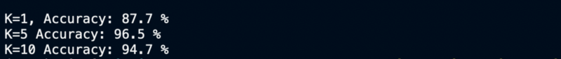
We can see that K=1 perform exceptionally badly because of it not taking in the input of a lot of neighbours, whereas K=5 and 10 performing almost similarly.
The code for building the model and getting the accuracy is as follows
#Import knearest neighbors Classifier model
from sklearn.neighbors import KNeighborsClassifier
#Import scikit-learn metrics module for accuracy calculation
from sklearn import metrics

#Create KNN Classifiers
knn1 = KNeighborsClassifier(n_neighbors=1)
knn5 = KNeighborsClassifier(n_neighbors=5)
knn10 = KNeighborsClassifier(n_neighbors=10)

#Train the model using the training sets
knn1.fit(X_train, Y_train)
#Predict the response for test dataset
Y_pred = knn1.predict(X_test)
# Model Accuracy, how often is the classifier correct?
print("\n\nK=1, Accuracy:",round(metrics.accuracy_score(Y_test, Y_pred)*100,1), "%")

#Train the model using the training sets
knn5.fit(X_train, y=Y_train)
#Predict the response for test dataset
Y_pred = knn5.predict(X_test)
# Model Accuracy, how often is the classifier correct?
print("K=5 Accuracy:",round(metrics.accuracy_score(Y_test, Y_pred)*100,1), "%")

#Train the model using the training sets
knn10.fit(X_train, Y_train)
#Predict the response for test dataset
Y_pred = knn10.predict(X_test)
# Model Accuracy, how often is the classifier correct?
print("K=10 Accuracy:",round(metrics.accuracy_score(Y_test, Y_pred)*100,1), "%")
KNN is one of the simplest algorithms to understand. It is fun to implement it. I would suggest you to try your hand at it.
This concludes our quick walkthrough of KNN Algorithm with python. Next time we will try to perform the same actions in R. I would suggest you to try other datasets and see what results you get. The full code can be found on github at this link.
 rishisidhu
Member discussion