Visualise Data With Google’s Facets — Tutorial in Pictures

No need to write a single line of code with this tool from Google.
Every Machine Learning engineer must know how to use Facets for their project — The No Code AI Tool. Facets, a project from Google Research, is being used to visualise datasets, find interesting relationships, and clean them for machine learning.
The No Code movement is on the rise and an increasing number of companies expect their engineers to quickly deliver results using pre-existing tools. From building web pages in minutes to creating mobile apps from a simple spreadsheet, no-code does it all.
The proponents of building products quickly are pushing hard for the no-code movement precisely because it lets you get to the state of the art in a matter of hours instead of weeks. In the times of Corona people are coming up with innovative ideas and implementing them using #nocode
Facets is a no-code AI visualisation tool. An important step in any machine learning project is to visualise the data before cleaning it or building models out of it. That makes sense. How would you clean your house if you couldn’t see the dirty areas?
Traditionally, most AI engineers analysed their data using libraries in Python.
Decision Tree Visualisation — Quick ML Tutorial for Beginners
A 10 line python code for beginners to construct a decision tree and visualise itmedium.com
Or even R.
How to Work Visually with Data — Tutorial in R
Learn how to visually decode a data set before applying an ML algorithm on ittowardsdatascience.com
But facets allows you to do all that by just uploading your data and clicking on various buttons. Let’s see how.
Facets Overview Tool
Facets provides an overview tool on their webpage.
Once you have uploaded the data the overview tool shows you the following things
- Statistics of the data — Min, max, median, std-dev
- Missing values — how many rows have no data
- Zero values — what percentage of data is 0
- Train/test split — A plot of how the dataset is split between the training and the testing data
Let’s look at the UCI Census Income dataset, used for predicting whether an individual’s income exceeds $50K/yr based on their census data. The census data contains features such as age, education level and occupation for each individual.
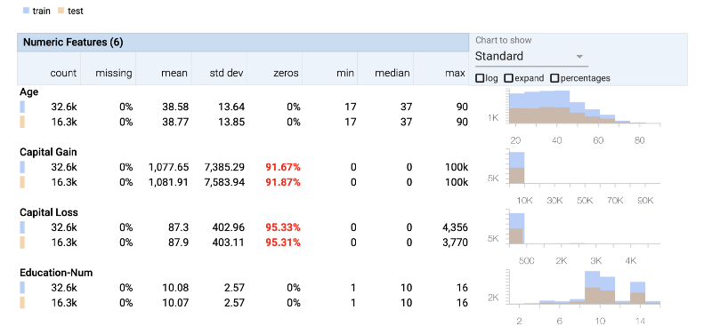
We can clearly see that both the Capital Gain column and Capital Loss column do not contain much information as most of their rows have 0 values.
We can also zoom into the plots on the right and observe the distribution of the data. That helps us to double check if our test data has similar distribution to the train data — we don’t want our data to be biased.
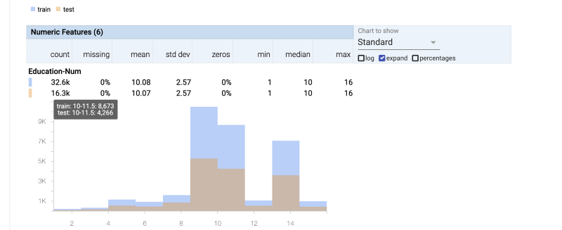
Sometimes the drudgery of checking all statistical details about each feature of our dataset causes us to skip looking at an important piece of information. This tool very concisely shows all features clearly.
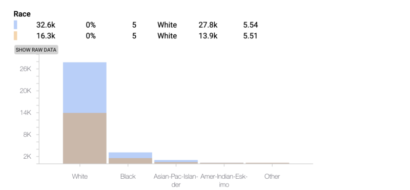
We can clearly see how the dataset has the most information about White people and thus is clearly going present biased results. This helps us provide context to our results.
Facets Deep-Dive Tool
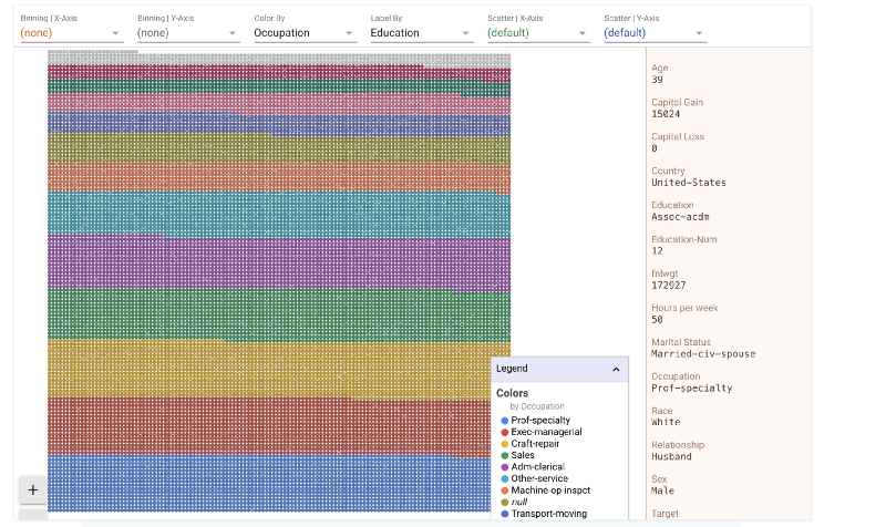
Once you have a broad overview of your data it then is time to move to the deep dive tool that lets you zoom all the way in to see a single datapoint.
Dive is a tool for interactively exploring large numbers of data points at once
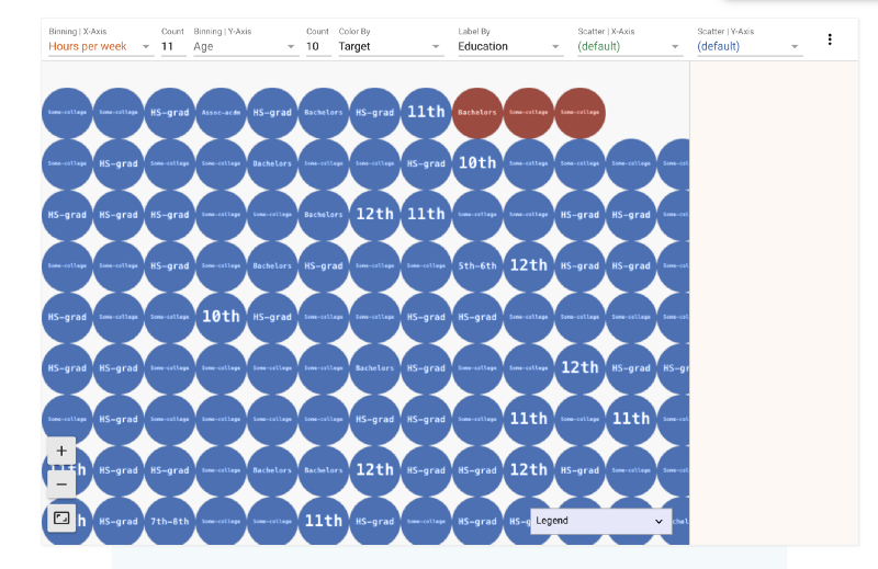
Dive provides an interactive interface for exploring the relationship between data points across all of the different features of a dataset. Each individual item in the visualisation represents a data point. Position items by “faceting” or bucketing them in multiple dimensions by their feature values
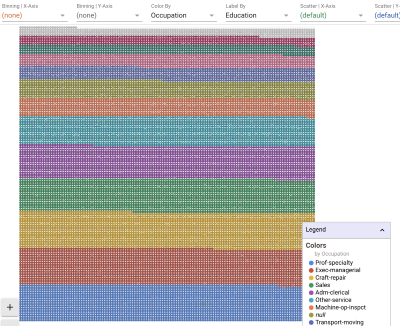
In the above image the whole dataset is “faceted” on the basis of education. These are all the data points. Clicking anywhere in the images brings up the details of a specific datapoint. Let’s click on a blue dot at the bottom of the image and see its details.
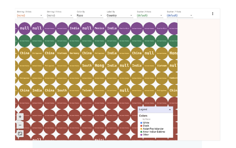
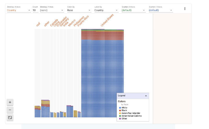
We could split the data by race as well or by any of the other features. Let’s look how race divide looks on this grid. In the figure below we have
- Color-By : Race
- Label-By : Country
That means that the data is split into different colors based on race. However, each point in the grid also has a label. That label is its country. Let’s zoom in and take a look
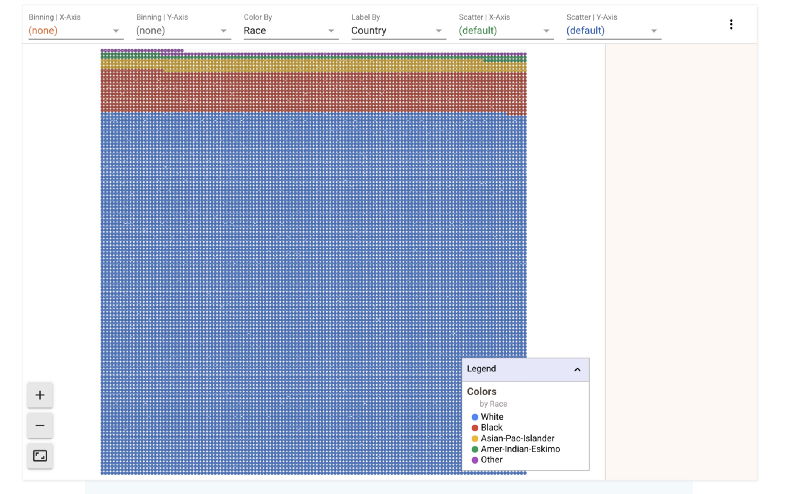
The binning option in the control panel above the grid lets us bin the data according to different features. Let’s say we wanted to see how the race split looks like across different countries.
There’s a clear bias towards United States as well. So we know that the majority of data points in this set belong to white Americans.
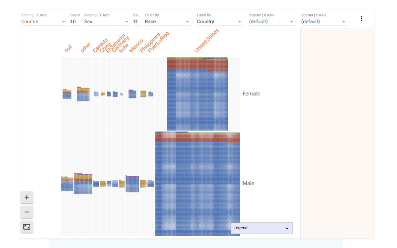
We have binned across the X-axis. What if we want to also find out how gender plays a role in this data. We can bin across Y axis as well. Now the data in the image below is split across Male and Female categories. We can see that females form a much smaller part of the dataset.
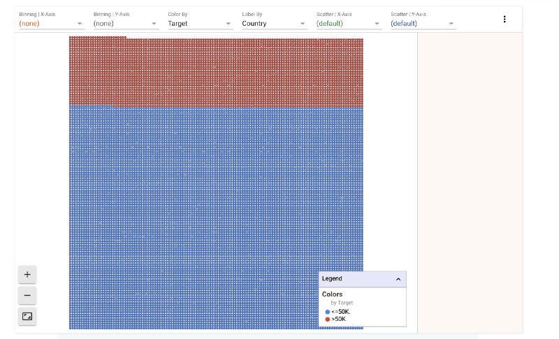
The dataset also contains salary for each individual. Any machine learning algorithm that evaluates this data set tries to predict the salary of an individual based on various features. Let’s try to see what effect age and sex has on salary.
1) Salary Split
A majority of the people in the dataset earn less than 50K.
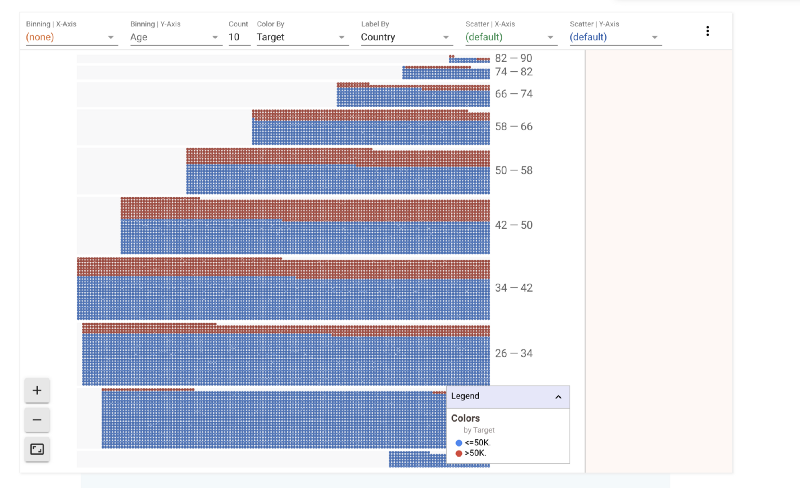
It would be interesting to see how age plays a role in this split. Let’s split this further by age range.
2) Age v/s Salary Split
It is interesting to see that above 58 and below 34 most people fall in the less than $50K category. The proportion of people earning more than $50K/year is highest in the 42–50 age bracket.
A corporate myth exists that the harder you work the more successful you are. Let’s try to see what effect the number of hours per week of work has on your ability to earn.
3) Hours/week v/s Age v/s Salary Split
The thicker middle shows that people between 34–42 years work the most and the most common work hour week is the 37–45 hour week. As one grows older (higher up on Y-axis) one tends to not work long hours.
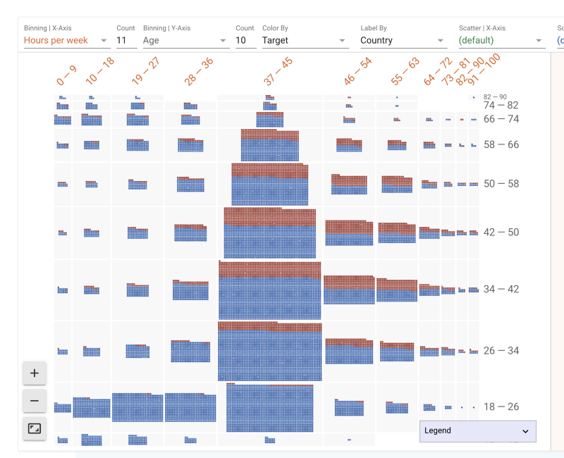
We also see the age group 18–26 working 19–27 hours. This might explain their side jobs. Let’s zoom in to look at their education level.
Facets provides a wide variety of tools to play with your data. It is fun! I would be excited to hear from you guys what you think of this library. To upload your own data you could use their web interface.
Or if you are really hell bent into not No-Coding you could also integrate it into your Jupyter Notebook.
Member discussion